 About This

About This Project
Encore is a fake fitness app company I created to use for branding and design projects on my YouTube channel. I created a logo for it years ago, but wanted to redo the logo properly and film my process. Because this logo design was being filmed, I didn’t create it using my usual process. Instead, I did the entire thing digitally from start to finish.
The Logo
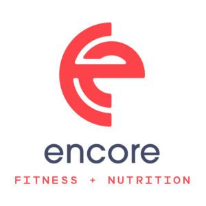
The logo is a combination of the letters E and C, combined together to make a unique looking icon that portrays strength. I really like how it turned out and I think it would work well as an app icon. Check out the full video for the logo design here.
The Business Cards
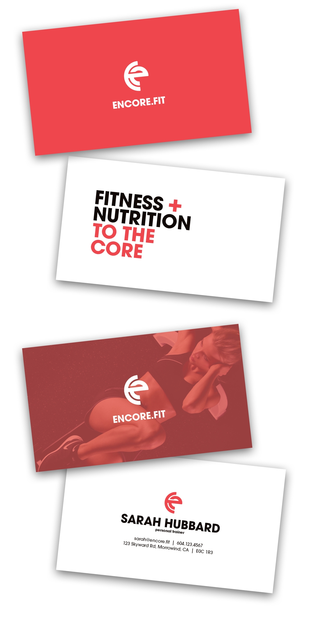
The business card designs for Encore are pretty basic. I did four different designs that are all up as speed designs on my YouTube channel.
The Website
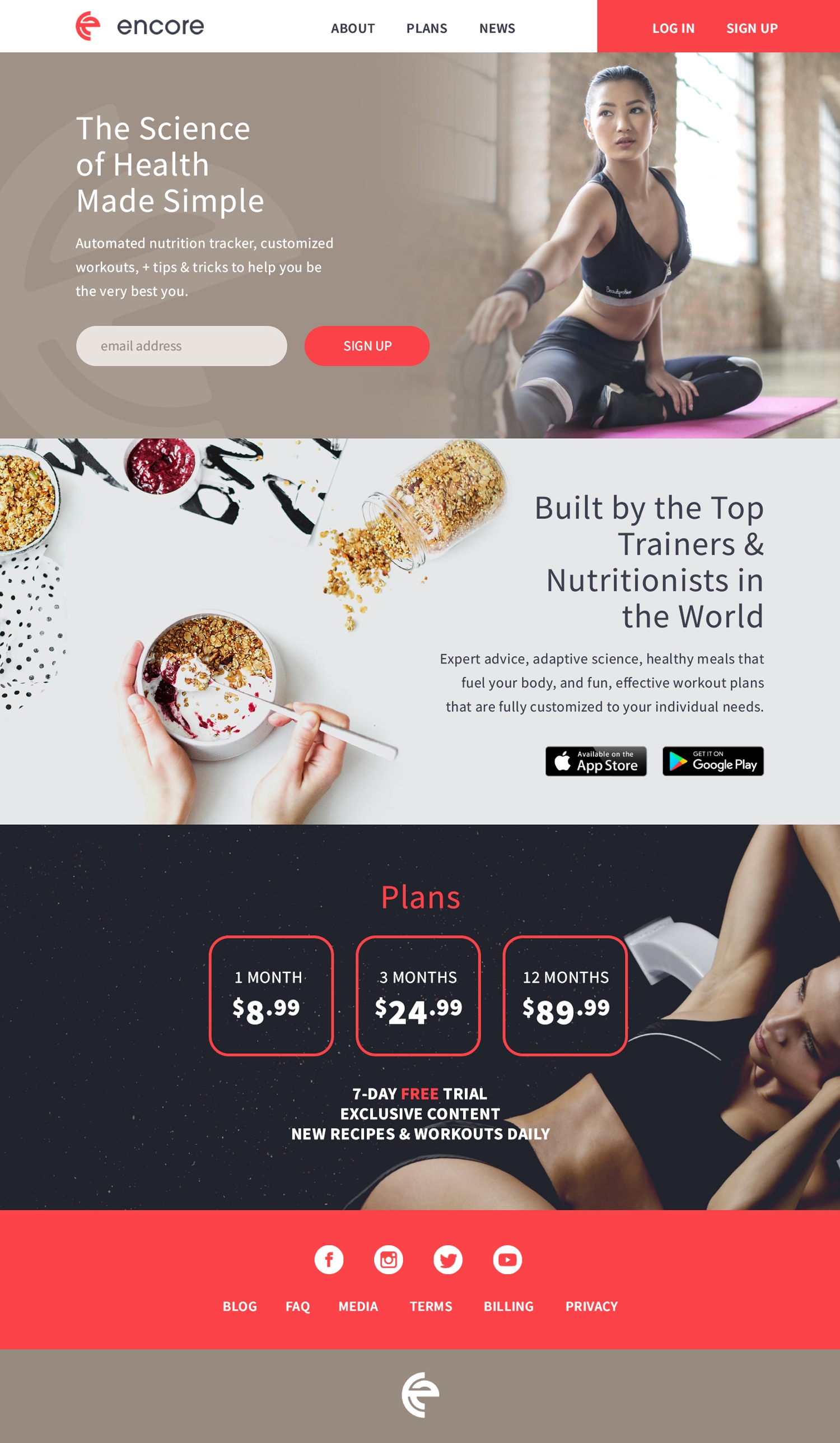
The website design for Encore was meant to be clean and simple to reflect the personality of the brand. Despite being a fake company, I see Encore as a company that strives to inspire people in their fitness goals through technology. While I haven’t created the app interface yet (which will also be on my YouTube channel), the website helps to set the look I’m going for.
Project Type
Identity design, print design, website design
Client
N/A YouTube Creative Project
Software Used
Adobe Illustrator, Adobe Photoshop, Adobe InDesign
